It may surprise you to learn that mobile devices account for 60% of all web traffic. Yes, smartphones account for the majority of visits to your website. a gadget that interprets your website differently from a desktop computer. Simply put, you risk losing more than half of your visitors if you do this wrong. Forever and many. It gives the significance of mobile-friendly websites a fresh perspective. Let’s examine the reasons why having a mobile-friendly website is essential for business success. Additionally, we’ll discuss how to make sure your website functions on desktop and mobile devices. A website that draws in and helps convert visitors instead of driving them away.
How can a website become “mobile-friendly”?
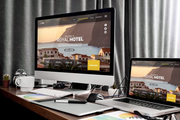
Mobile-friendly websites, often referred to as responsive websites, are designed with careful consideration for how they will display on different types of devices. On a tiny screen, these websites are simple to read and use. A hostile website isn’t. You see, you can browse almost any website on a smartphone or tablet. In the address bar, type the URL to access most websites. The way they appear on a mobile device is more important to the definition of mobile-friendly. To locate and view content on a website that is not mobile-friendly, you must zoom in and out and scroll. Words may flow off the page or the text may appear to be too tiny. It’s challenging to perceive images clearly. It’s challenging to locate and click on links.
A mobile-friendly website adapts to the device type automatically.
As an illustration:
- The text adjusts its size to match the screen, making it easier to read.
- The navigation menu condenses into a dropdown menu that is simple to use. Have you seen the three horizontal lines on your phone that make up the default navigation menu? This flexible design component is the “hamburger menu.”
- The buttons enlarge to make clicking them easier.
- It’s simple to navigate.
Are people finding your website using mobile devices?
We assure you that they are. There are mobile users on all current websites. However, you want to know just how important mobile friendliness is to your company. We have everything covered! Connect to Google Analytics to learn more.

Is your website mobile-friendly?
You can see how important it is to have a website that is mobile-friendly. Therefore, it’s critical to understand whether your website is responsive.
There are four easy methods to find out:
- Employ Google’s tool for mobile-friendly pages. Visit Google’s mobile-friendly tool and enter your URL to receive a basic evaluation of a specific page.
- Make use of your phone. The next is a more sensible choice. Give it a go! Take out your phone and enter your URL. Does it appear as sharp and clear as our website? It might not respond if it doesn’t.
- Make use of your desktop. It’s also available for desktop use. Open your website to see how responsive it is. Adjust the window size of your browser. To accomplish this, move your mouse pointer over the window’s boundary until the double-headed arrow cursor shows up, and then drag the border to progressively shrink the window’s size. A website that is mobile-friendly will adjust itself to fit the changing screen size.
Verifying that your website is mobile-friendly is a good idea even if you think it is. Still, web designers build websites without considering responsiveness. You have to do this correctly.
Four reasons having a mobile-friendly website is essential to its success
Mobile-friendly websites creation are crucial for a variety of reasons, including bettering SEO, boosting user behavior, boosting conversions, and optimizing time spent on your website.
Promotes obliging guest conduct
Visitor behavior is impacted by the distinction between mobile and non-mobile friendly websites. Consider using Google observed that:
According to 75% of smartphone users, people are more inclined to visit a mobile-friendly website again in the future.
- 50% of respondents said that websites that are not mobile-friendly irritate and frustrate them.
- 69% stated that a mobile-friendly website increases their likelihood of purchasing an item or service.
- 65% of respondents claimed to abandon a website if they can’t locate what they’re looking for right away.
- 51% said that if a firm they liked didn’t have a mobile-friendly website, they would use it less frequently.
- 37% said that viewing unresponsive websites was a waste of time.
A website that is optimized for mobile devices motivates users to interact with the material and take action, such as making reservations and purchases.
Boosts SEO
Websites with a responsive design are popular on search engines. It’s a fact that mobile-first indexing exists. Lack of a mobile-friendly website can hurt your search engine optimization and probably lower your ranks.
Boosts conversion rates
An optimized mobile website can increase conversions—the quantity of visitors who complete a certain task—and so help you achieve greater success. As an illustration:
- Making an appointment by clicking the button
- Clicking the call-to-phone number
- Activating instructions using geolocation
Sites that are optimized for mobile devices and routinely employ such bold measures provide impressive outcomes.

Extends visitors’ time on your website
A mobile-friendly website presents material in a manner that users on mobile devices are accustomed to and desire. They’re therefore more inclined to stick around. Your visitors will be more engaged if your website additionally has a top-notch blog, reference pages, and other content. They will investigate and grow to respect your brand and practice.
Now is the time to make your website responsive! Mobile-friendly websites and non-mobile-friendly websites differ significantly. A website that isn’t responsive is like a big anchor dragging your company down. A responsive website shortens the learning curve and increases the success of your practice. In AJAI Studio we look forward to assisting your company in growing with our mobile-friendly web design skills, site-building know-how, and in-depth understanding of what works for your business.


